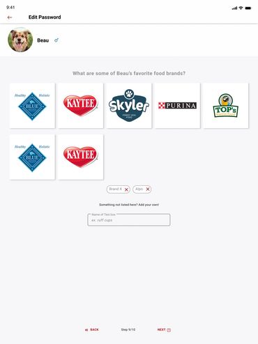
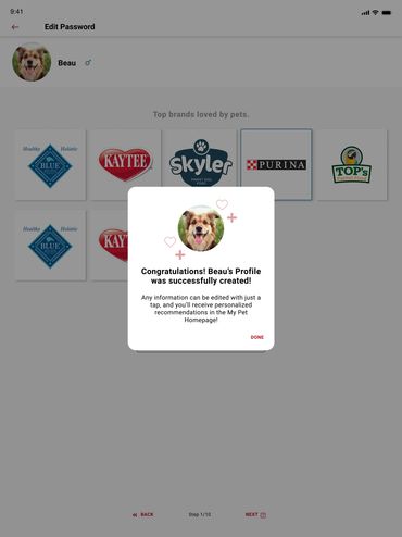
E-Commerce Application
Lead E-Commerce Developer
Design Time: 7 months
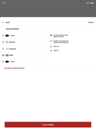
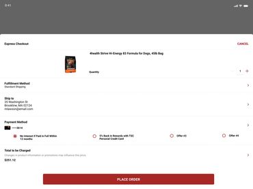
Description of Problem - Multiple problems arose for users attempting to interface with the E-commerce screens.
Synopsis - Led planning and rollout of enterprise-level e-commerce applications, delivering user-friendly features on schedule. Directed cross-functional collaboration to translate requirements into accessible design solutions. Supported application deployment, reducing checkout friction by 15% through strategic updates. Developed wireframes and prototypes using Figma and XD, enhanced by HTML, CSS, and JavaScript programming.
Software


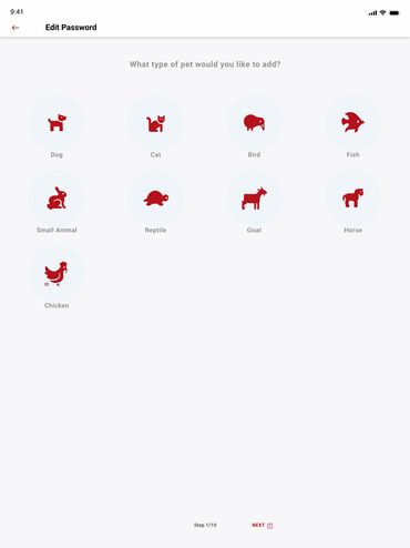
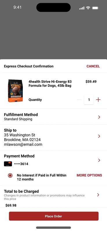
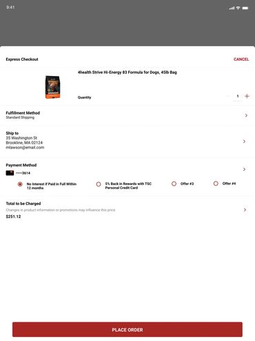
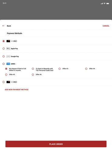
Location Screen Access
Location Adjustment Confirmation Screen
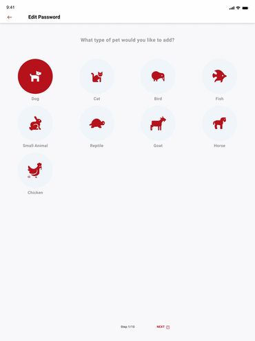
Location Adjustment Screen

Utilizing a hot spot located beneath the logo, the user was able to access the Location Adjustment screen.
Location Adjustment Screen
Location Adjustment Confirmation Screen
Location Adjustment Screen
Location Adjustment screen allows users to quickly and efficiently use geo location or zip code to alter their Home Store.
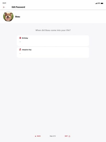
Location Adjustment Confirmation Screen
Location Adjustment Confirmation Screen
Location Adjustment Confirmation Screen
Location Adjustment confirmation screen locks home store into place.
_Pag-b4d6eac.jpg/:/cr=t:0%25,l:0%25,w:100%25,h:100%25/rs=w:400,cg:true)
Hypothesis
After researching strategies implemented by comparable applications and industry standards learned over the years I presented the results to the team.
Hypothesis:
Optimized store locator experience to drive in-store traffic and reduce support calls. Redesigned the entry-point icon with dynamic location previews and micro-interactions, enabling users to instantly view the nearest store or search by city, ZIP, or store number. High-fidelity Figma prototypes and A/B testing in React resulted in 28% faster store selection, 15% higher click-through to directions, and a 12% drop in “where’s my store?” inquiries.
Test
User was tasked with maneuvering in the home screen, identifying default store and easily and intuitively changing store preference.
Results:
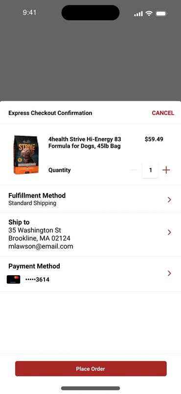
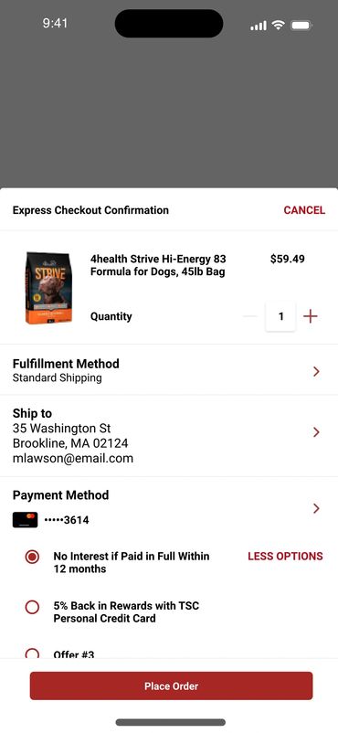
Validated streamlined checkout flow through rigorous usability testing and heatmapping. Users consistently reduced task completion from 7 to 3 clicks, praising the predictive search and one-tap “Buy Online, Pick Up In-Store” toggle. Remote moderated sessions (n=42) and unmoderated Maze tests confirmed 91% task success rate (up from 64%), with 87% rating the flow “very intuitive”—driving a 19% increase in BOPIS conversions post-launch.
Outcome
TSC enlisted the aid of Usertesting.com to test the results. Beyond the scope of the test conducted on 4 users, other data points pertinent to the usability were discovered.
Outcome:
Overhauled enterprise design system to unify 40+ touchpoints across web, mobile, and in-store kiosks. Consolidated 3 legacy style guides into a single, scalable React component library with WCAG 2.2 AA compliance, dark mode support, and Figma Tokens Studio integration. Post-launch audit showed 97% component adoption across teams, 63% faster UI handoff, and 41% reduction in visual inconsistencies—establishing the new standard for all future digital products.
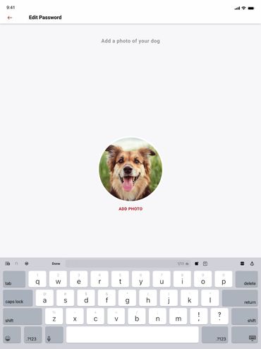
Product Review Screen
Product Review Screen add photos
Product Review Screen add photos
Allows the user to rate add reviews and photos of their products.
Product Review Screen add photos
Product Review Screen add photos
Product Review Screen add photos
Allows the user to upload photos of their products.
Internal Time Card App
Product Review Screen add photos
Internal Time Card App
Internal TSC App allows users to track time and request times off.